Creating The Crimson Night
- brotherstevenh9
- Mar 24
- 9 min read
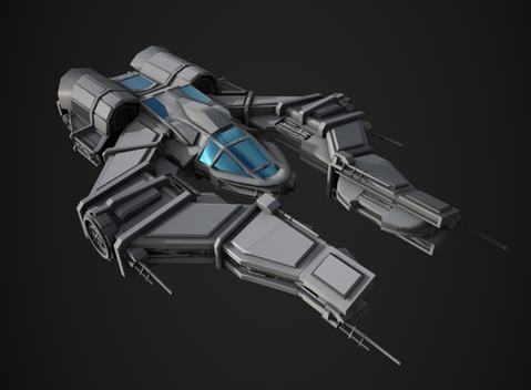
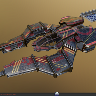
The Crimson Night is a dystopian-style ship inspired by the Star Wars franchise. The initial concept for the vessel was actually drawn by myself around four years ago. It started its life as a pixel art ship, as at the time—before university—I was working on my own indie game called Our "Last Stand."

Re designing to work in a 3d Enviroment
Before diving into the intricacies of 3D modelling, it’s essential to understand the overall shape language of the vessel and what it represents. This was a particularly challenging task, as I had to break the ship down and analyse the original design to determine what the different components were, what their functions might be, and why they were placed where they were.
Thankfully, I had already established the ship’s purpose, which helped guide this process. In its early stages, the vessel was designed as a cargo freighter. When I was first learning pixel art, I used the game FTL to experiment and understand how ships are constructed. This served as a strong foundation and jumping-off point for developing my own design, which I eventually turned into a fully playable mod for the game.
You can actually check out the mod here on Nexus mods:
The ship is ultimately designed as a cargo vessel, intended for transporting goods between nearby systems. It relies heavily on drones and unmanned droids to carry out its functions, which explains the large number of antennas present throughout the design.
Generating initial concepts
started by analysing what worked and what didn’t within the original design. I appreciated the asymmetry; however, it became clear that it lacked purpose. In particular, the function of the smaller wing was not well defined, and even now the original intention behind it remains unclear.
As a result, one of the first changes I made was to remove the asymmetrical design.
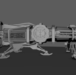
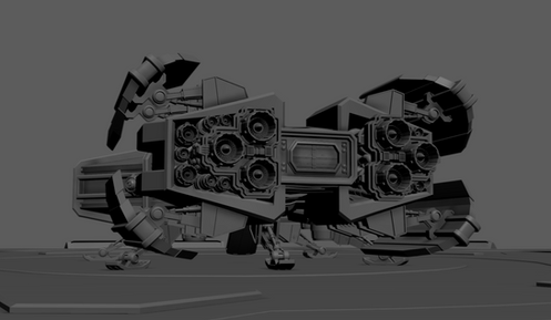
From there, I began developing a rough blockout of the engine bays, while retaining the large upper window that allows visibility into the interior.


Afterwards, I began to examine the original design in more detail, focusing on the glass viewing platforms located along the inner side of the ship. I started blocking out the overall shapes of these elements to better define their structure within the model. The outer edge of the ship is also intended to function as a docking section, serving as a primary access point and entry hatch for the vessel.


The next major task was refining the wing and cockpit shapes to better match the original design.


At this stage, I was relying quite heavily on the Millennium Falcon for reference, and I think that influence comes through a little too strongly.
I wanted this ship to have its own identity, so later on I revisited the shape of the cockpit ports, as they very clearly resembled those of the Falcon.


Alongside the Millennium Falcon, I also drew heavily from Star Destroyers and other large Imperial ships for design inspiration. I noticed that areas of the vessel which suggested functionality—such as mechanical operations or key systems—tended to feature dense clusters of greebles. Another defining characteristic I observed across these ships was the presence of mechanical or piping components running along the sides, creating a long strip that visually separates the top and bottom sections of the hull.
You may have also noticed that the inner glass viewing platforms from the original design are now gone. The reason behind this is that they didn’t really make much sense in practice. They ended up being positioned directly against the cockpit area, with the glass dome facing the cockpit glass itself, which defeated their intended purpose as viewing platforms. This raised the question: why would there be a viewing platform designed to look into the interior of the vessel?


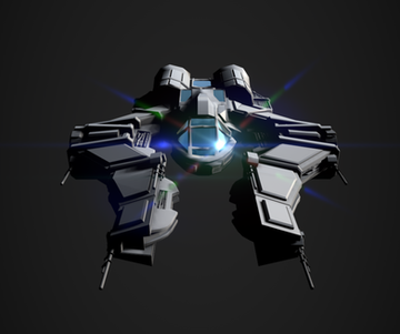


At this point, I began considering how the ship would actually land and how its weight should be distributed across the landing gear.
Taking inspiration from the Millennium Falcon, I explored a configuration with three legs at the rear and two additional supports extending from the front wings. These were positioned in a way that would be practical to rig and animate later within a game engine.
I also looked to the X-Wing’s landing gear for inspiration. I wanted the overall silhouette of the ship to remain angular and aggressive, while contrasting this with more rounded landing pads.
This helps communicate a sense of danger while in flight, but stability and safety when the landing gear is deployed.


With most of the exterior sorted, I began to struggle more and more with visualising the cockpit. Even with a mannequin in the scene, it still felt overwhelming, so I decided to block out a basic interior instead.
This was relatively simple, as I had previously created controls for an Apache attack helicopter, so I reused those as a temporary solution and placed them into a rough mock-up interior for the time being.


The next step was to put more thought into how the crew would actually enter and exit the ship. Once again using the Falcon as inspiration, I added a ramp that could raise and lower, providing a practical access point for boarding and disembarking the vessel.


Feeling more confident with the direction of the design, I took a break from modelling and carried out some paint tests. I learned a lot from this process and realised I knew very little about how Star Wars and dystopian ships are actually painted, and why they are designed that way.
I spent time studying various dystopian vessels and noticed that they are rarely painted a single uniform colour. Similar to how greebles are clustered in specific areas, colour is also used to guide the viewer’s attention to key parts of the ship. I took this insight on board and applied it later in my design process.


After spending some time painting on the model, I realised that the shape language didn’t fully make sense at this stage. The wings and landing gear were very angular and sharp, which effectively communicated that these were dangerous areas of the ship. Landing and taking off are hazardous procedures, and the sharp angles reinforce that idea visually.
The wings themselves are quite narrow and exposed, representing the outer areas of the ship that the crew would venture into. These sections are more vulnerable, with less protection from the vacuum of space. This is also where cargo is loaded and unloaded, and where the ship would dock with stations or other vessels—making it a risky operational area. The very front sections of the wings are even more slender and less armoured, further emphasising their exposure.
In contrast, the central area of the ship, where the cockpit is located, is more rounded. The intention behind this was to communicate that the centre of mass is the safest area for the crew, where they would spend most of their time.
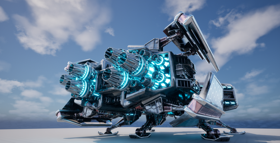
However, I also noticed a contradiction in my design thinking. The rear engine mountings are also rounded, even though the engines are powerful and potentially dangerous pieces of machinery. Being exposed at the back of the ship, they are likely one of the most volatile sections of the vessel. Because of this inconsistency, I decided that a redesign of the shape language was necessary.


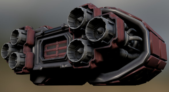
I very much leaned into the styling of the Star Destroyer engine mountings. You have the main thruster array, surrounded by smaller clusters of greebles, and the pointed, angular design of the mounting structure helps communicate a sense of danger and mechanical power.
Originally, I created curved ports, but I was never fully satisfied with how they turned out. They still appeared quite angular rather than the smooth, aerodynamic spoiler-like shape I was aiming for. Because of this, I revisited and refined that part of the design.
I also repurposed the landing gear to function as deflector panels, which eventually evolved into solar panels. The reasoning behind this decision is that the cargo bay is still located within the engine mounting area, and since this is a space where the crew would spend a significant amount of time, I wanted to introduce a subtle sense of curvature there. This creates a balance—reinforcing that it is still a dangerous area, but with a small degree of visual comfort.
To achieve this, I used four deflector panels, which were also set up to be rigged and animated later in development.


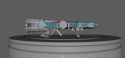
Next was my first proper test inside a game engine, initially using Unreal Engine.
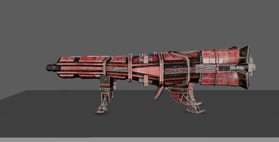
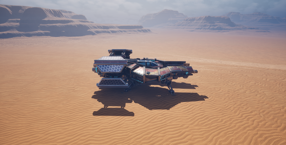
I repainted the ship, focusing on individual panels rather than applying a uniform colour pass.
I only painted about half of the inner sections of the ship, leading up towards the main cockpit area, which was primarily highlighted in red.


After my test in Unreal Engine, I moved over to Unity, as I know enough C# to get by. This allowed me to create a basic ship controller so the vessel could be flown and animated more easily.
Happy with the results, I returned to modelling to begin developing more of the interior. My initial plan was to model the interior of the wings as well, but at some point during development I lowered the wings to allow more visibility into the cockpit. Doing this meant the hatch connections no longer aligned in a way that would be relatively easy to integrate, so I decided to leave the wing interiors for now. I may return to this idea later, but for the time being they are not necessary.
The central table in the cockpit is animated: it closes and then slides down into the floor, revealing stairs that open up and allow access in and out of the ship for the crew.
There is now a full take-off and landing procedure, which can all be controlled using a game controller. The ship can take off, fly around, and land again smoothly. The deflectors adjust to match the direction of movement, and the thrusters activate to provide a visual indication of the ship’s weight being lifted off the ground.


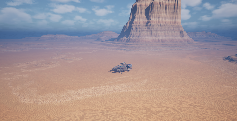
This is the current stage of development for the project.


I went back to the drawing board for painting. I have learned an immense amount about how to paint sci-fi paneling and metallic components, so I decided to re-UV and optimise the overall shape of the vessel.
Not sure how well this comes across in these renders, but halfway through the project all of the vents and grating were fully modelled. In the current version, they are instead represented as textures, which helps save on computational power.
I have significantly lowered the poly count, but it is still higher than I’d like. I am currently going over the entire ship and optimising it further, reducing geometry wherever possible. I will then rely more heavily on normal maps to retain surface detail while keeping the mesh performance efficient.
In reflection:
Throughout this project, I developed a much deeper understanding of sci-fi ship design, both in terms of visual language and technical implementation.
One of the most important lessons was recognising that design decisions need to serve a clear function. Early on, I found myself relying heavily on established references such as the Millennium Falcon and Star Destroyers.
While these were extremely useful for learning shape language and detailing techniques, I also realised that they were unintentionally influencing the design too strongly. As a result, I had to step back and re-evaluate how to give the ship its own identity.
I spent too much time early on in this project gettting sucked into the minor details, I needed t ostep back sooner and finish the overall body before getting stuck in.
A key part of this process was constantly breaking down and rebuilding the form. I analysed each section of the vessel—wings, cockpit, engine mounts, and landing gear—and questioned what each part communicated.
This helped me refine the shape language so that dangerous areas felt sharp and exposed, while safer, crew-focused areas were more rounded and controlled. However, I also discovered inconsistencies in this logic, such as rounded engine sections that contradicted their intended function, which led to further redesign work.
Another major learning point was the importance of iteration through testing.
Moving between Unreal Engine and Unity allowed me to understand how the ship behaves in a real-time environment, particularly in terms of scale, animation, and control. Implementing a full take-off and landing system helped reinforce the design, especially through visual feedback such as moving deflectors and active thrusters that communicate weight and motion.
I also gained a much stronger understanding of optimisation and game-ready workflows.
Early in development, many elements such as vents and grates were fully modelled, but I later transitioned these into texture work using normal maps to improve performance. I also revisited UV layout and overall mesh efficiency to reduce the poly count without sacrificing visual detail.
Finally, the project taught me a lot about visual storytelling through materials and colour. By studying dystopian sci-fi design more closely, I learned how colour and detail density are used to guide attention and reinforce function, rather than simply being applied uniformly across a surface.
Overall, this project has significantly improved my understanding of environment and hard-surface design, as well as my ability to balance artistic intention with technical constraints. While the project is still in development, it has become a strong foundation for both my design process and future work in real-time environments.
Now this project is not finished and I will be creating another Blog post when it is complete.
Going forward, I need to further reduce the poly count, finalise the overall paint work on the ship, and bring it back into Unity. My goal is to create a small scene setup where the ship can be fully flown and interacted with in a controlled environment. I also need to spend some time learning more about material optimisation, as there are currently too many materials in the project for it to be properly optimised.

Comments